CYGM Build one

↑↓ to move Enter to open Esc to close ? for shortcuts

00 Viewer tour v1.1.10 Release

2026-10-15

A memory card of readings, turned into something you can actually read.

With a micro-SD card fitted, the display quietly writes down every reading it receives — one small text file per day. The card viewer opens those files in your browser and turns them into charts, patterns, percentages and plain-English sentences. This page is the whole thing, screen by screen.

What you get, before anything else

There is nothing to install and nothing to sign up for. The viewer has a Try it with sample data button, so you can prod every screen below without owning a device or having a card in your hand.

  • Runs entirely in your browser
  • No upload, no account, no server
  • mg/dL or mmol/L
  • Your own zone ranges
  • CSV and PNG export

Every screenshot on this page uses the viewer's built-in sample data: two weeks of invented days and 3,820 readings, all shown in mg/dL. None of these numbers belong to a real person. Two weeks is just the size of the demo — a day of readings is about 9 KB, so even a small card holds years of them, and the viewer will read every day you hand it.

How it goes

Three steps, and the third one is just scrolling.

1 You hand it the files

Drop them on the page and let go

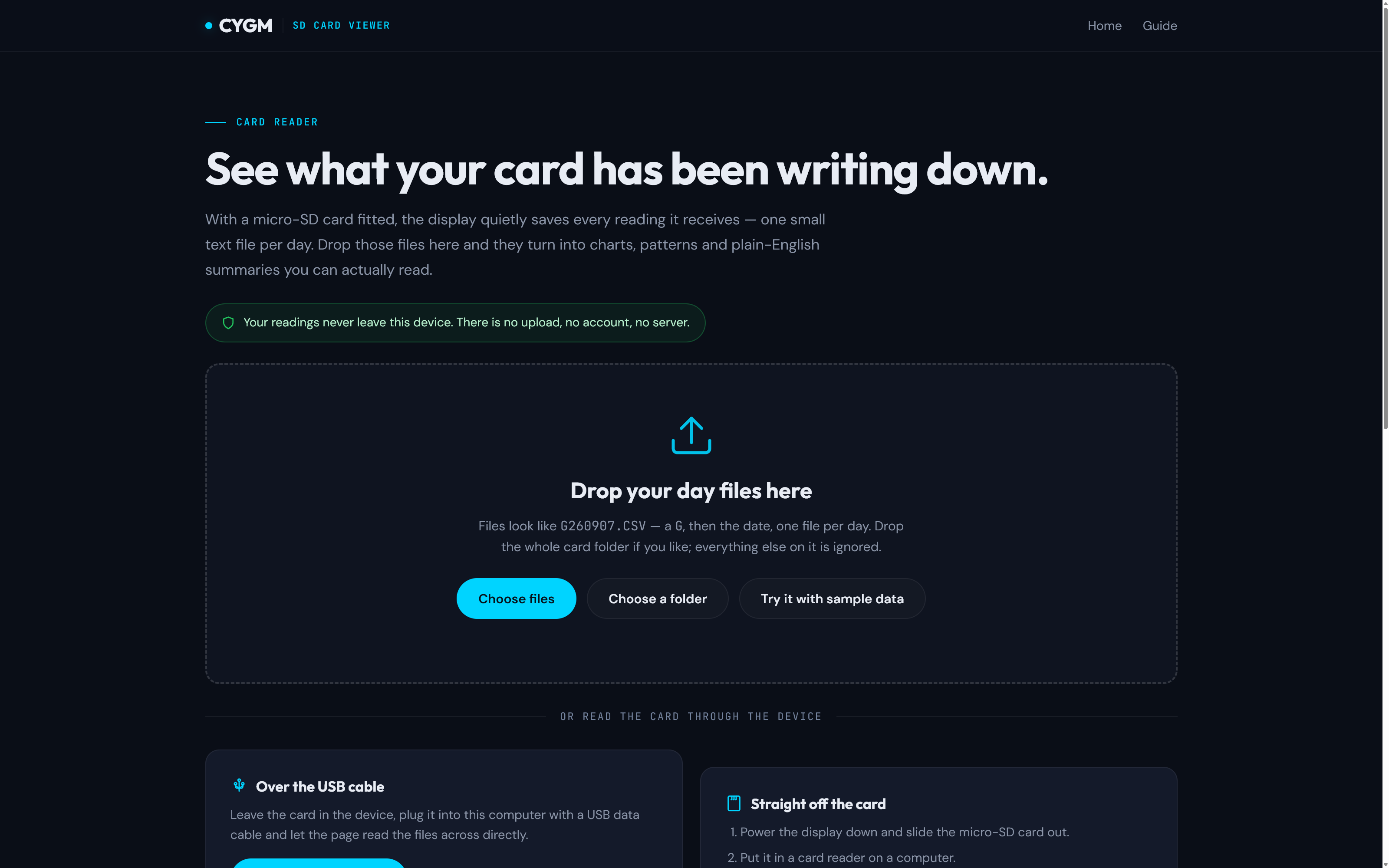
Open the viewer and it asks for nothing. The workspace is already there: the toolbar across the top, a card saying nothing is open yet, and under it the box your files go in. Drag your day files onto the box, pick them with Choose files, or point it at the whole card folder and let it work out which ones matter — the serial logs and screenshots also sitting on the card are quietly skipped.

Day files are named by date, so G260907.CSV is the 7th of September 2026. In a hurry, or just nosey? Try it with sample data fills the whole page in an instant.

  • Drag and drop
  • Choose a folder
  • Sample data
  • Or read it over USB

What you arrive at, with nothing loaded yet. View full size
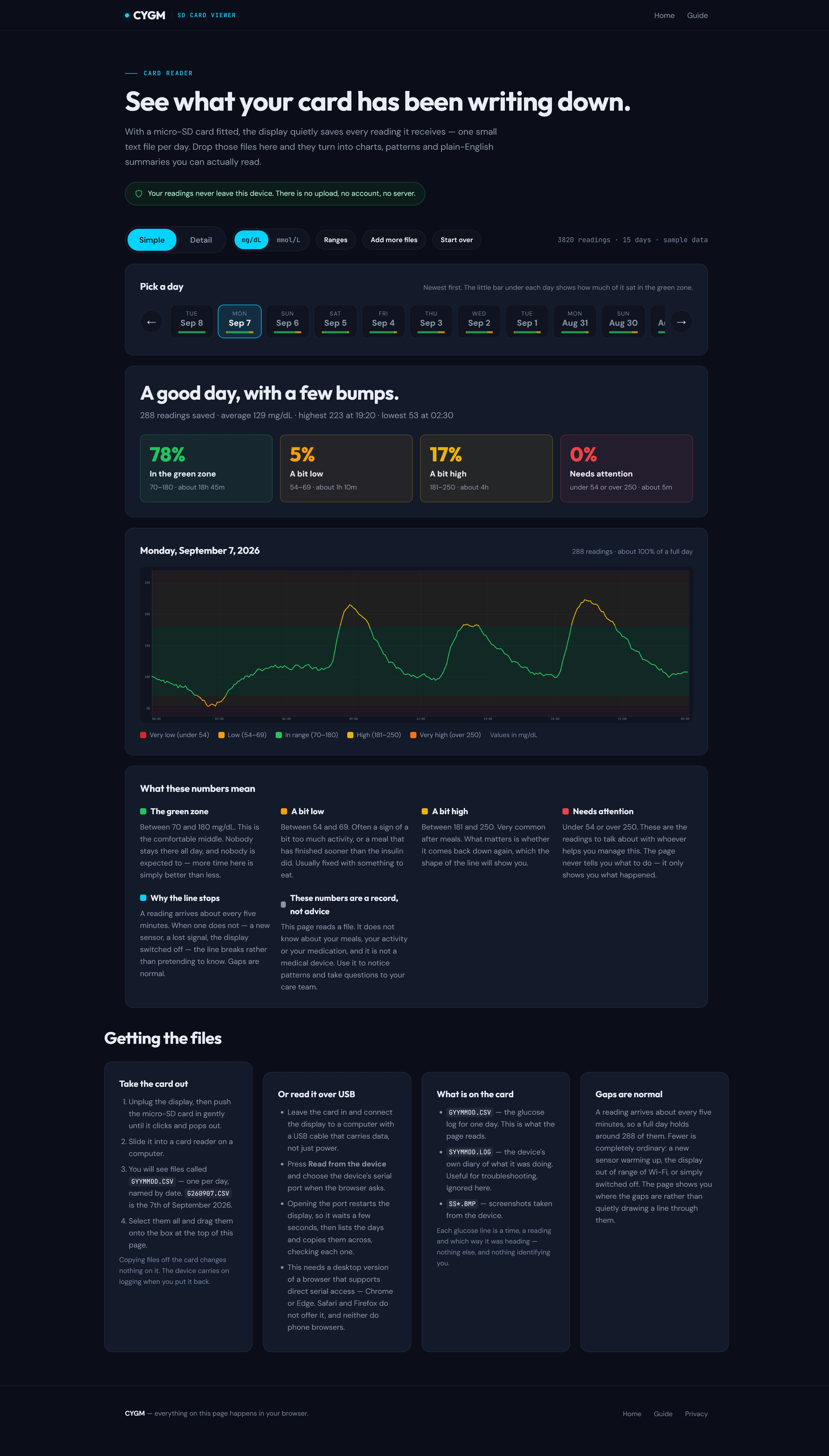
2 The Simple tab

One day, summed up in a sentence

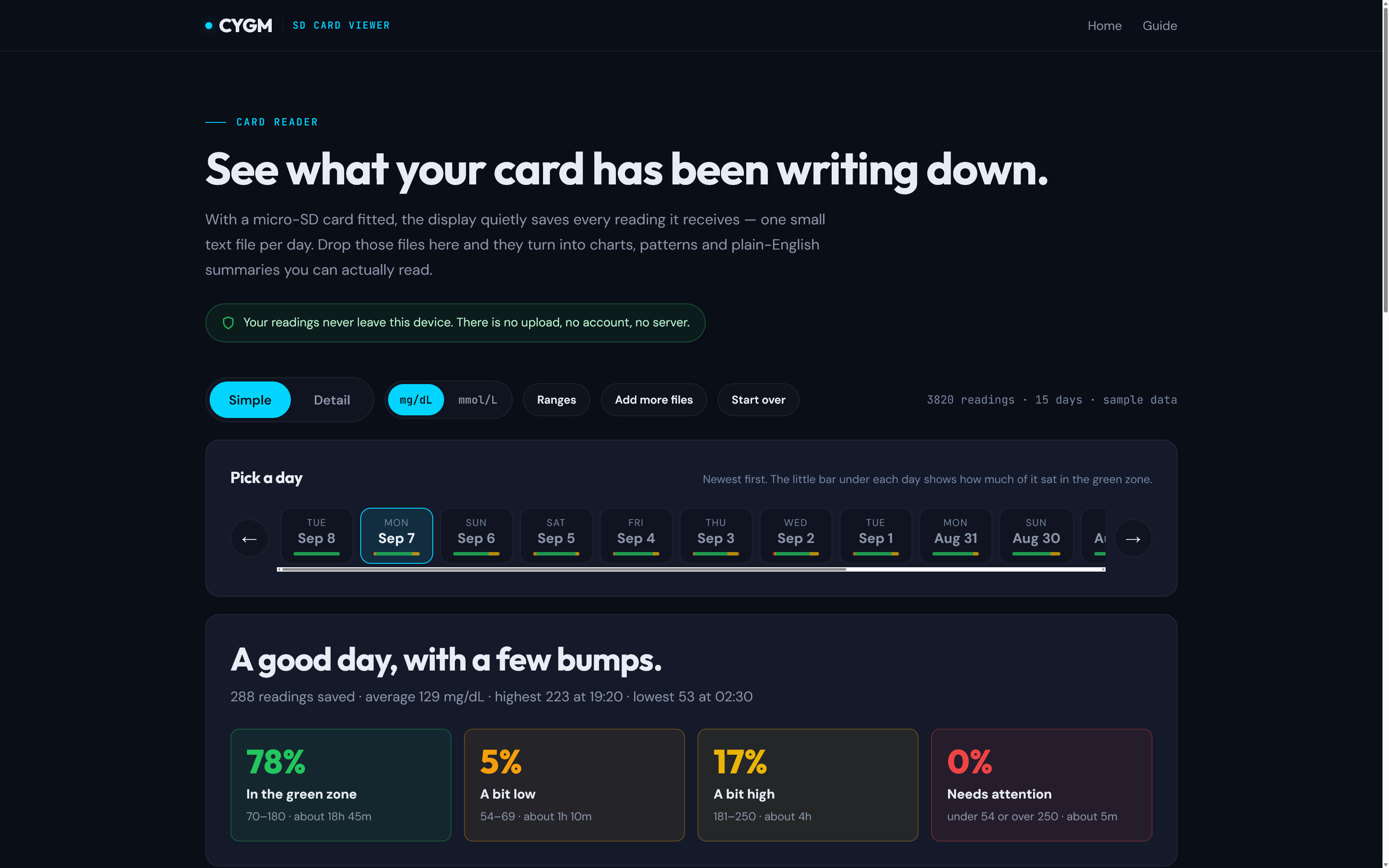
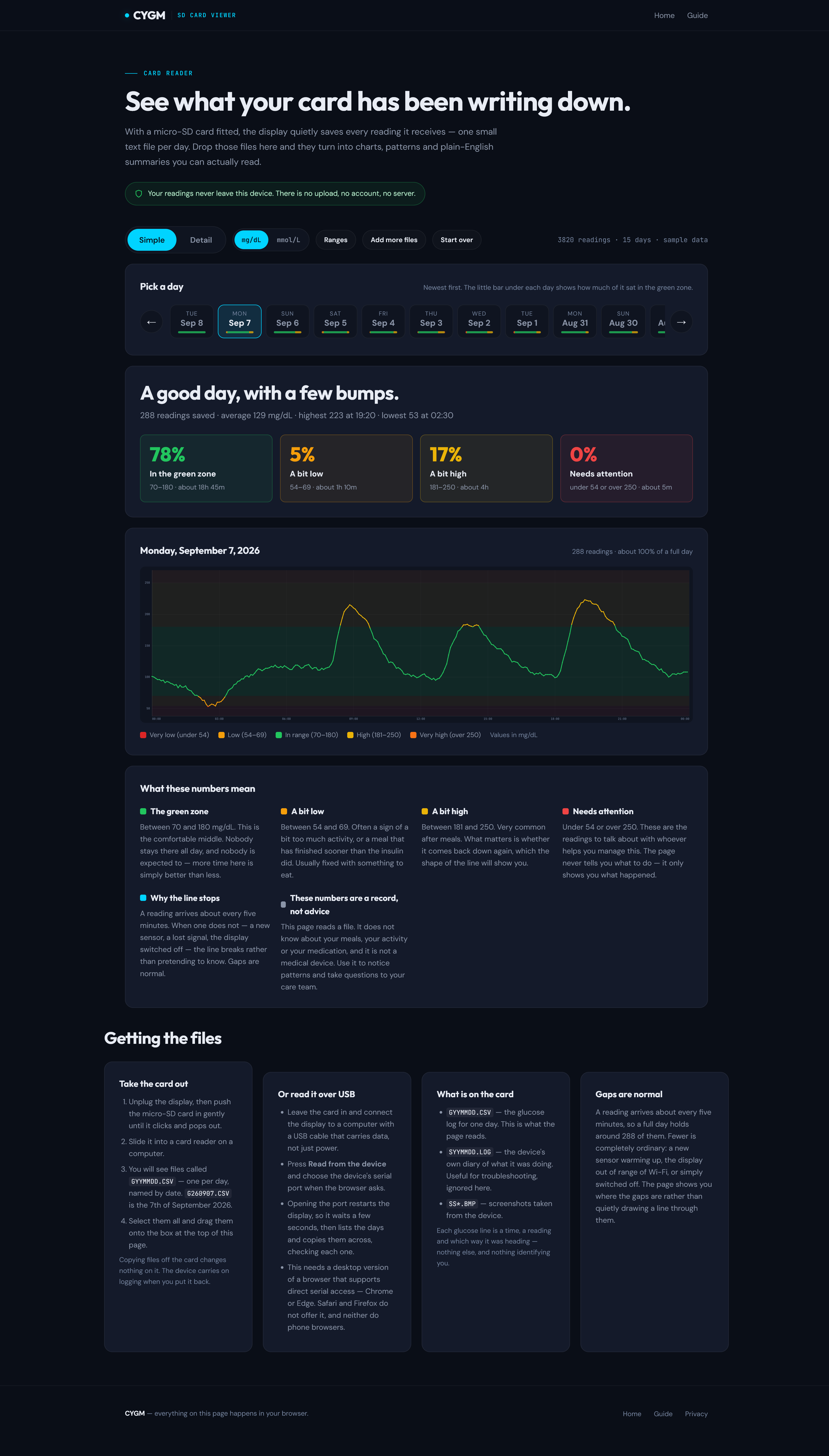
Days line up along the top, newest first, each with a small bar showing how much of that day sat in the green zone. Pick one and the page says how it went in ordinary English, then breaks it into four tiles: the share of the day spent in range, a bit low, a bit high, and the readings that need attention — each with roughly how many hours that adds up to.

The day showing here came out 78% in the green zone, 5% a bit low, 17% a bit high and nothing at all needing attention, averaging 129. Under the tiles the day is drawn hour by hour, and under that sits a short explanation of what each zone actually means.

Every screenshot here is in mg/dL, but a single toggle in the toolbar swaps the whole page to mmol/L — tiles, charts, table and all — and it stays swapped next time.

  • In the green zone
    right where you want it
  • A bit low
    under the green zone
  • A bit high
    over the green zone
  • Needs attention
    a long way from the green zone

Day picker, headline and tiles — 7 September, 78% in the green zone. View full size

3 The Detail tab

Every reading you loaded, on one line

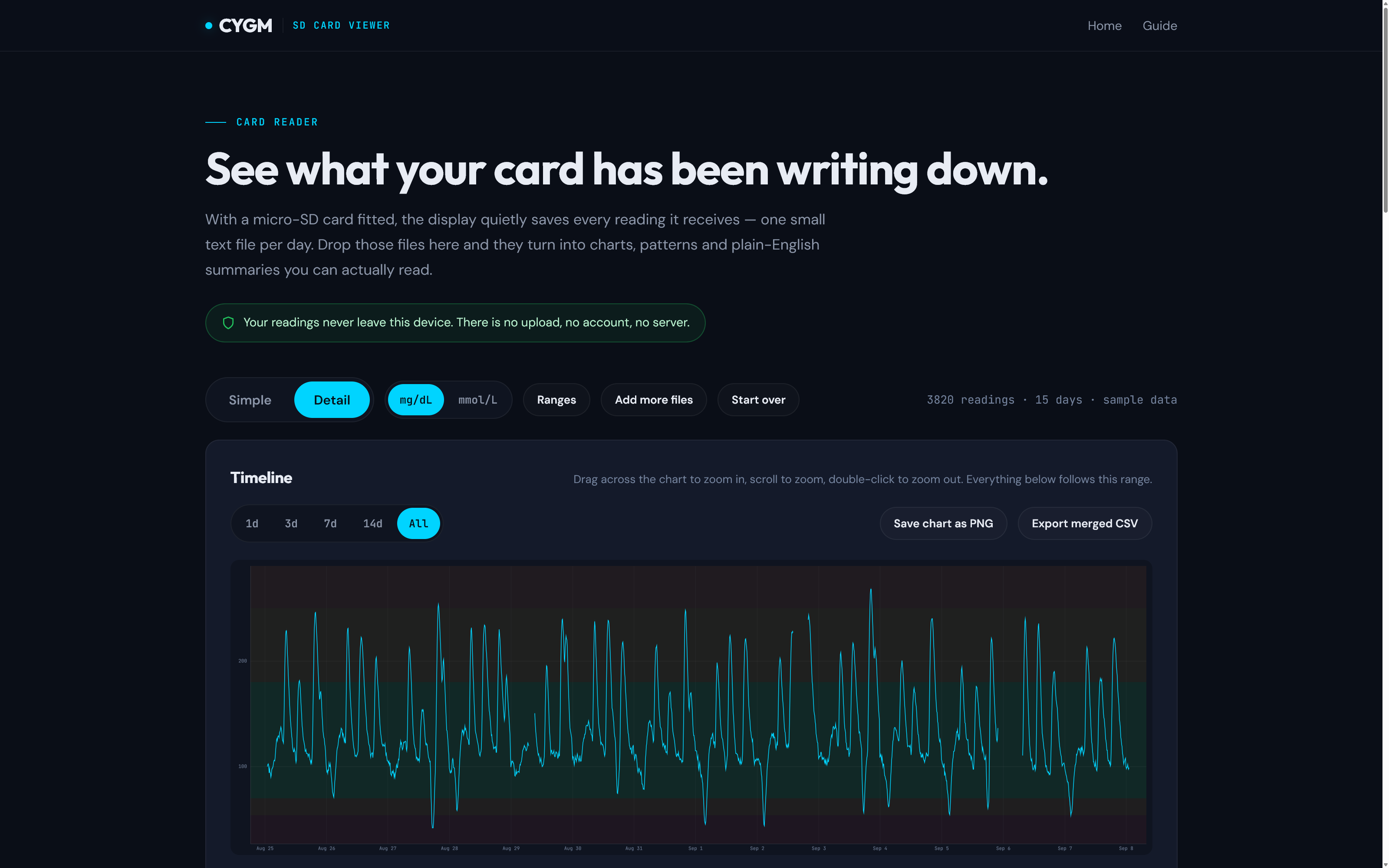
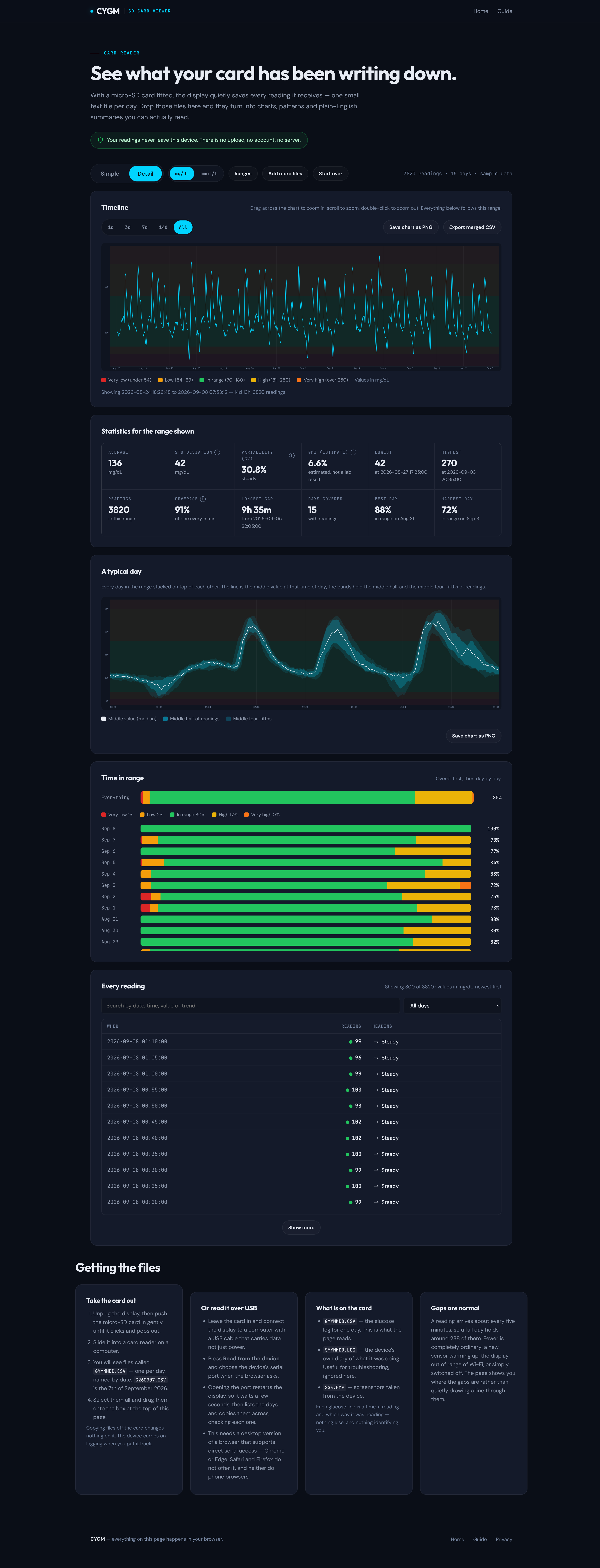
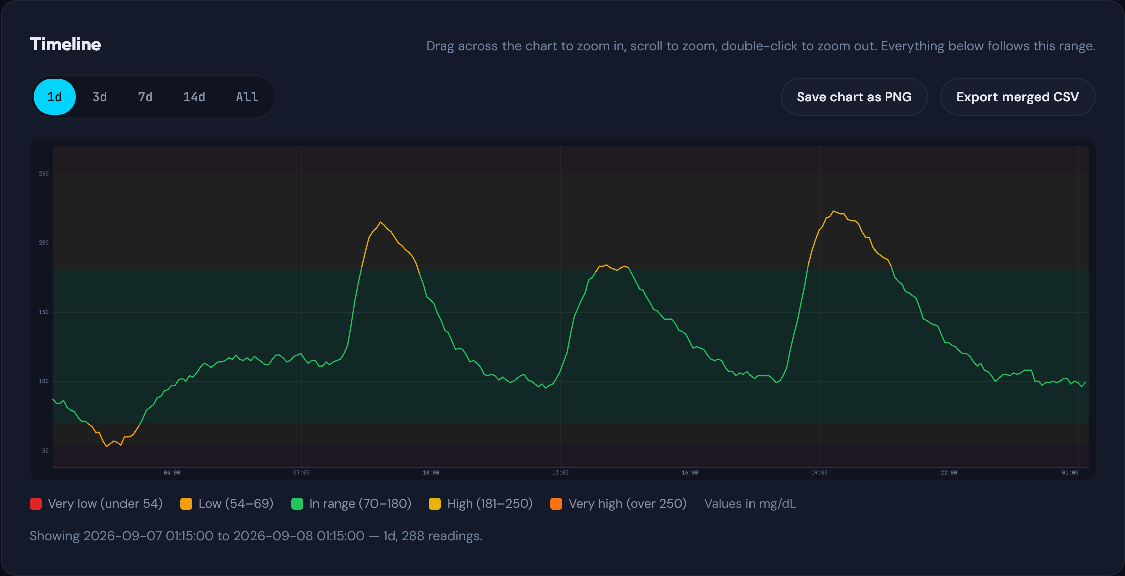
Switch to Detail and the timeline draws the whole stretch at once, shaded behind by your zones. Drag across it to zoom into a patch, scroll to zoom, double-click to zoom back out, or jump straight to 1d, 3d, 7d, 14d or All. It takes arrow keys too, so you can pan and zoom without a mouse.

Everything further down the page follows whatever you are looking at. Narrow the timeline to a rough Tuesday and the statistics, the typical day and the time in range all narrow with it.

  • Drag to zoom
  • Scroll to zoom
  • 1d / 3d / 7d / 14d / All
  • Arrow keys pan

The timeline, showing the whole sample at once. View full size

The whole page, top to bottom

Two very tall screenshots, in frames you can scroll. This is what is actually in front of you once the files land — no cropping, no cherry-picking.

Simple, end to end

Day picker, headline, tiles, the day drawn hour by hour, and the plain-English explanation of every zone.
The entire Simple tab as one tall screenshot: toolbar, day strip, headline, four zone tiles, a full-day line chart, and a card explaining what each zone means.

Scroll inside the frame View full size

Detail, end to end

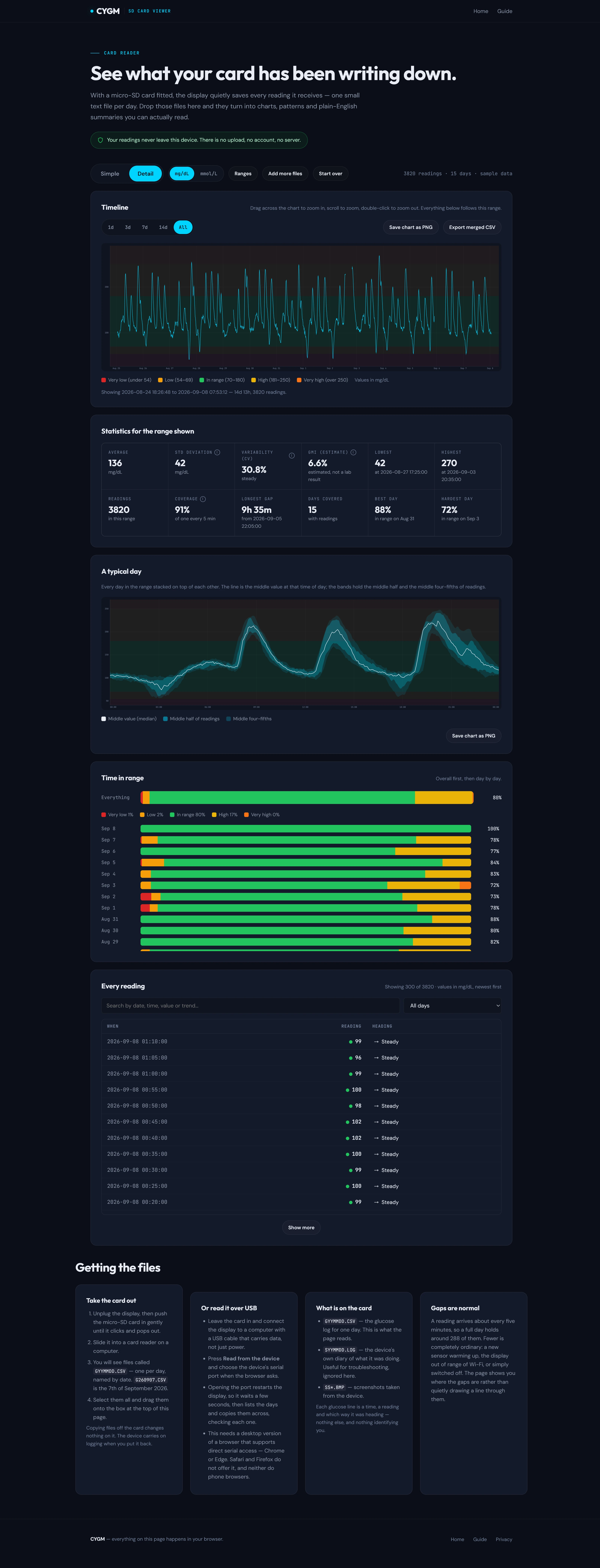
Timeline, twelve statistics, the typical day, time in range overall and per day, then every single reading.
The entire Detail tab as one tall screenshot: the timeline chart, a grid of twelve statistics, the typical-day chart with percentile bands, time-in-range bars, and the searchable table of every reading.

Scroll inside the frame View full size

The bits worth pointing at

Close-ups of the parts people tend to stop and look at. Click any of them to see it properly.

Wind it in to a single day

The same timeline, zoomed to one day. Your zones sit behind as coloured bands, so a night spent low or a stubborn afternoon high reads as a shape rather than a wall of numbers.

Where readings stop, the line stops. Nothing is drawn across a sensor change or an evening with the display switched off — you get to see the hole instead of a confident straight line through it.

View full size

A typical day

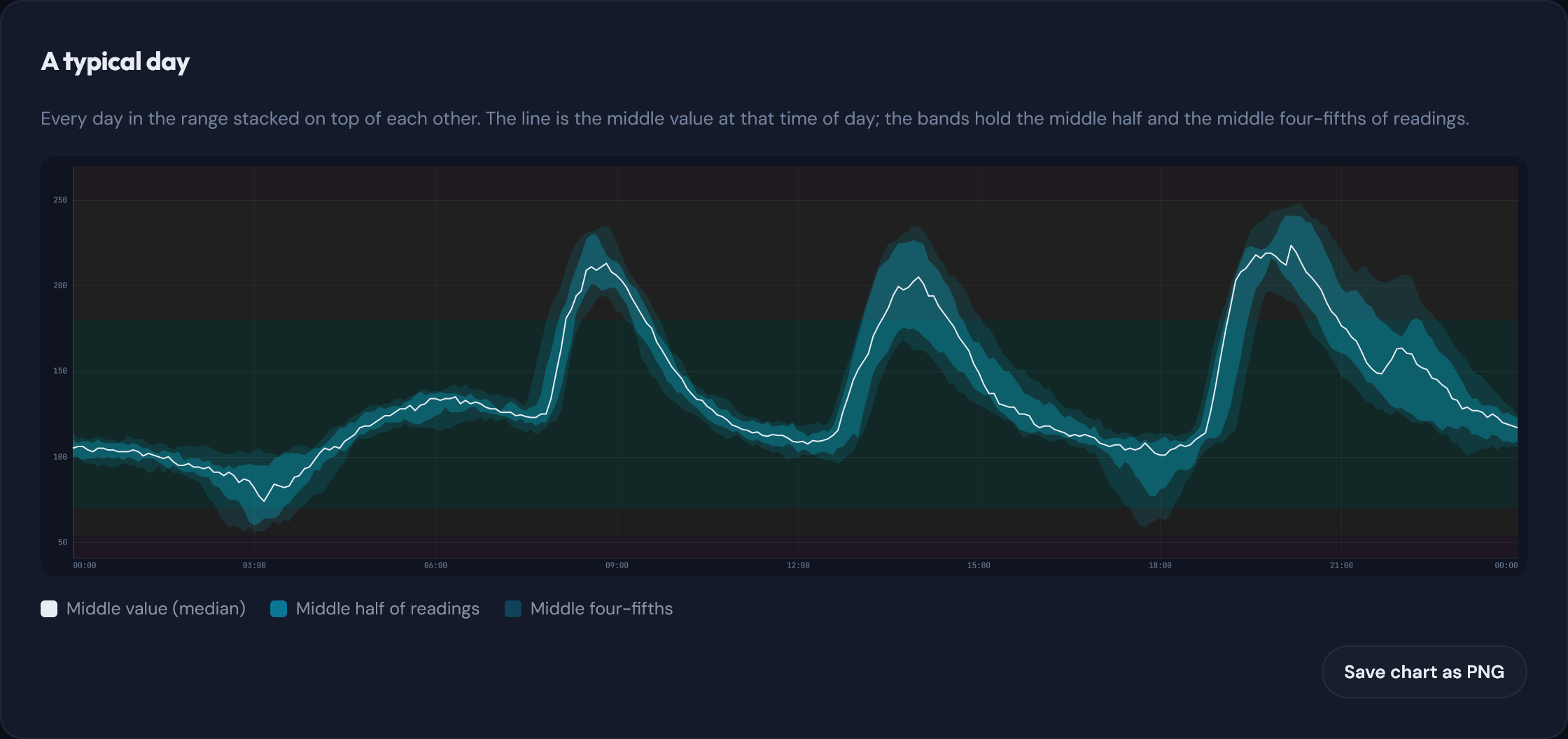
Every day in the range stacked on top of each other. The line is the middle value at that time of day; the bands hold the middle half and the middle four-fifths of readings.

It is the quickest way to spot a pattern that no single day makes obvious — that mornings are steady, say, and three in the morning is not.

View full size

Twelve numbers, and what each one means

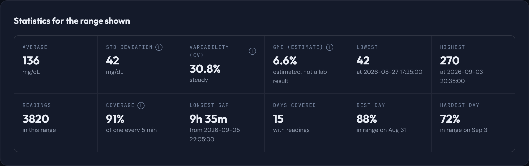
All twelve recalculate for whatever range the timeline is showing. Four of them carry a short explanation, because "CV" and "GMI" mean nothing at all until somebody says them in English.

Across the two sample weeks they read: average 136, standard deviation 42, variability 30.8%, lowest 42, highest 270, coverage 91%, longest gap 9h 35m, best day 88% in range and hardest day 72%.

The estimated index labelled GMI — 6.6% here — is worked out from these readings alone. It is an estimate of what a long-term marker might look like, not a lab result, and the page says so on the tile.

  • Average
  • Std deviation
  • Variability (CV)
  • GMI (estimate)
  • Lowest
  • Highest
  • Readings
  • Coverage
  • Longest gap
  • Days covered
  • Best day
  • Hardest day

View full size

Time in range, overall and day by day

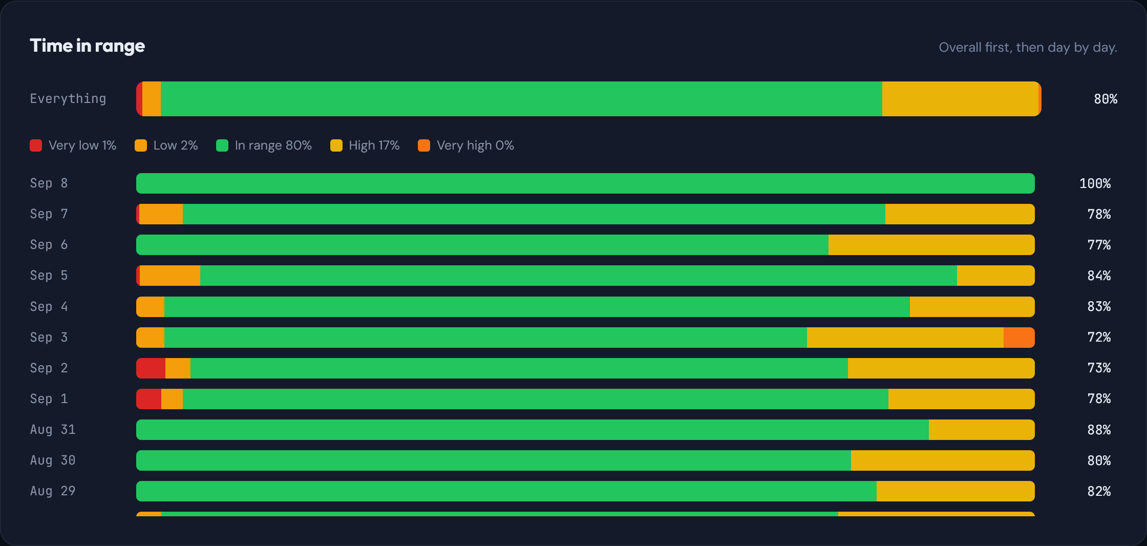
One bar for everything you are looking at, then a row for each day underneath. Good weeks and rough weeks separate themselves without you having to do any arithmetic.

View full size

Every single reading, searchable

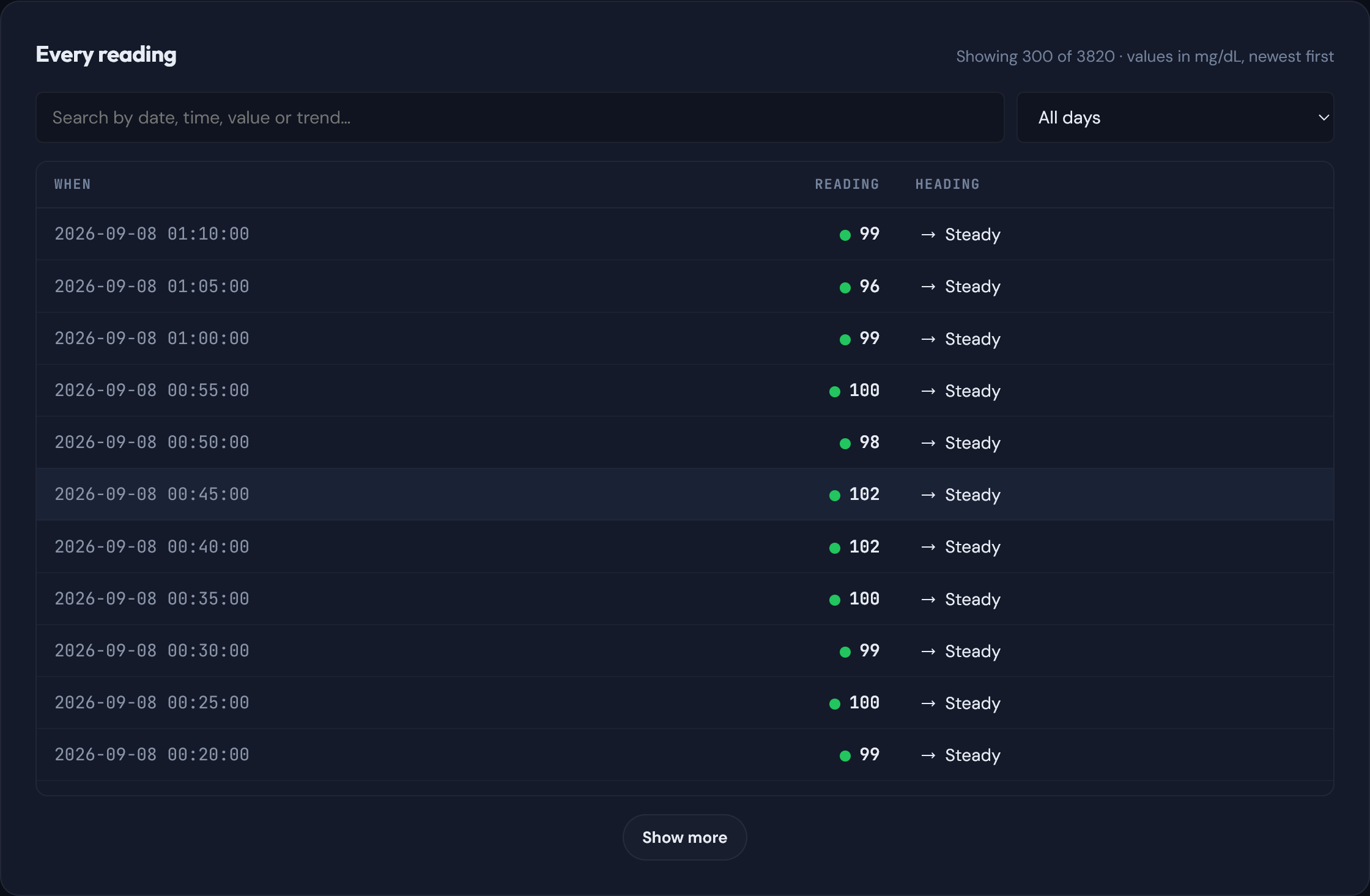
Nothing is locked away behind a summary. Each reading is listed with its time and which way it was heading, and the search box filters as you type — a value, a time, a date or a trend. There is a day filter beside it when you already know where you are going.

View full size

Your ranges, not somebody else's

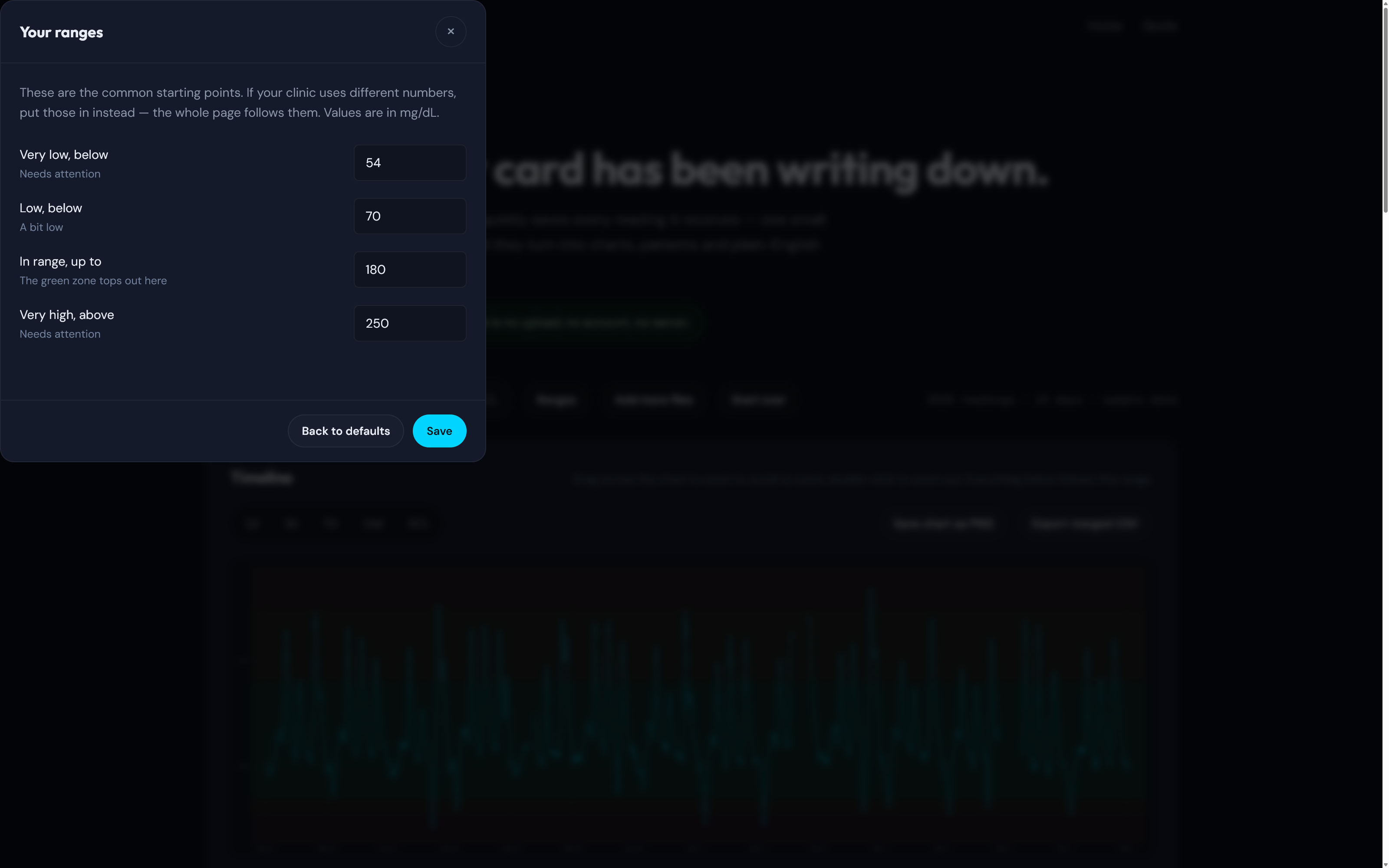
The sheet opens over whatever you were reading, dimmed but still sitting there. The zones start at the usual defaults — very low below 54, low below 70, in range up to 180, very high above 250 — but if your clinic works to different numbers, type those in instead.

Every tile, band, bar and percentage on the page follows them straight away, and the page remembers them for next time.

View full size

Take the numbers with you

Export merged CSV stitches every day you loaded into one tidy file, already trimmed to the range you are looking at — handy for a spreadsheet, or for handing to someone who asked.

Take the pictures too

Save chart as PNG drops the timeline or the typical-day chart out as an image, exactly as drawn. Good for an appointment, a message, or a fridge door.

Fine on a phone, too

Same page, same numbers, stacked to fit a narrow screen. The tiles go one above the other, the charts shrink to suit, and the day strip becomes something you swipe.

The one thing a phone cannot do is read the card over the USB cable — that route needs a desktop browser. Files copied off the card work anywhere.

The Simple tab on a phone-width layout, shown as one tall screenshot: toolbar, day strip, headline, four stacked zone tiles, the day chart, and the explanations below.

Scroll inside the phone.

Two ways to get the days in

Pop the card out, or leave it where it is and read it across the cable. Both end up in the same place.

Straight off the card

  1. Unplug the display and push the micro-SD card in gently until it clicks and pops out.
  2. Slide it into a card reader on a computer.
  3. Drag every G…CSV file onto the drop zone.

Copying files off the card changes nothing on it. Put it back and the device carries on logging exactly where it left off.

Over the USB cable

  • Leave the card in and connect the display with a USB cable that carries data, not just power.
  • Press Read from the device and pick the device's port when the browser asks.
  • It lists the days on the card, you tick the ones you want, and it copies them across, checking each one.

This route needs a desktop browser that can talk to a serial port — Chrome or Edge. Everywhere else, take the card out and drop the files instead.

Nothing leaves your browser

No upload

The page reads the files itself, on your machine. They are never sent anywhere.

No account

Nothing to sign up for, nothing to log into, no email address asked for.

No server

There is no back end behind this. Close the tab and the readings are gone from it.

Nothing identifying

Each line on the card is a time, a reading and a direction. That is the whole of it.

Go and have a play

The viewer is one page, open to anyone. The sample-data button means you can try every screen on this tour right now — no device, no card, nothing to install.

The screenshots on this page are sample data. CYGM is a secondary display for readings you already have — it does not measure glucose and it is not a medical device.

A second screen, not your source of truth

CYGM is an open-source, experimental secondary CGM display. It is not FDA-cleared or FDA-approved, and it has not been clinically validated. It shows readings that have already travelled through your own CGM's app and cloud service, so it can lag, gap or fail independently of them.

Never use it as the sole basis for a treatment decision, and never rely on it as your only alarm. Always confirm on your prescribed CGM receiver or app before dosing or treating.

Devices online

Loading

Grouped by city, never by device. A city appears when at least one device there has checked in within the last half hour. Placement is approximate.