00 Card viewer v1.1.10 Release
2026-10-15
See your glucose history, and a live reading, on your computer
With a memory card fitted, your CYGM display writes down every reading it receives, one small file per day.
USB cable
Leave the card in. Connect the display, press one button, and read every day straight off it. The same connection shows the live number.
Card in a reader
Take the card out, put it in any reader, and drag the day files onto the page. Works in every browser, on any computer or phone.
Your history, clean
Day by day charts, time in range, a summary you can read at a glance, and exports you can hand to a clinic. Sample data if you just want a look.
Jump to: getting your card in · privacy · the live reading · looking properly · taking it with you
- 3Ways in
- 7Things you can save
- 10sLive refresh
- 0Uploads
01 Getting your card into it
Three ways in, and one of them needs no card at all
Two ways to get at them: plug the display into your computer with a USB cable and the viewer reads the card in place, or pop the card out and put it in a card reader and drop the files on the page. Either way you get clean charts, a plain summary of each day and a printable report. And while the cable is connected you also get the live reading, refreshed every ten seconds, big enough to read from across a room. Free, no sign-up, and nothing leaves your own computer. Pick whichever suits what you have in front of you. Then open the viewer and do it.
Card reader Take the card out
Unplug the display, push the card until it clicks and pops out, and put it in a card reader. Then drag the day files onto the page, or the whole card if you like, because it ignores anything that isn't a day of readings. Copying files off a card doesn't change it.
USB cable Or leave the card in and use a cable
Plug the display into your computer with a data cable and press the button on the page. Your browser asks you to pick the display from a short list, and the page reads the days straight off the card. Opening the connection restarts the display, so give it a few seconds.
Sample data Or just have a play first
Press Try it with sample data and the page fills itself with a couple of weeks of invented readings, so you can click around every part of it first. Start over clears it out again.
If the cable route comes up empty Some computers hold on to the chip inside the cable connection and won't offer the display in that list. There's a second button, Read over USB instead, that goes at it a different way, and on an Android phone that is the one that works. I haven't tested the cable route from an iPhone, so I can't promise it works there. A card reader is the safe bet.
And where it won't work
- Dropping files in
- Any modern browser on any machine. Chrome, Edge, Safari, Firefox, computer or phone.
- Using the cable
- Chrome or Edge, on Windows, macOS, Linux, Chrome OS or Android. Safari, Firefox and the iPhone don't offer it, and the page says so rather than failing quietly.
- On the display itself
- A microSD card for the day files. Logging switches itself on whenever a card is fitted. The live reading over the cable needs reasonably recent firmware.
02 Privacy
Your readings never leave your computer
Not "we don't sell it" and not "we keep it safe". The page has no way to send it anywhere. Prove it yourself: load the page, turn your network off, then drop your files in, click around every chart and save the report. It all still works.
I check the same thing from the other side. The code that runs the viewer is one file, and I search it for every way a web page has of talking to a server. There are three mentions of those words in the whole file and all three are comments explaining that none of them are used.
One thing about the card rather than the page: erasing a display doesn't touch the memory card. If you're handing a device to somebody else, take the card out.
03 A spare monitor
Turn any screen in the house into a big version of the display
While the display is plugged in with the cable, a bar appears along the bottom with the current reading in it. Not a copy from the card, the number on the device right now. It shows the reading, which way it's heading, how long ago it arrived, the battery and whether the display has Wi-Fi, and it refreshes every ten seconds until you press Disconnect.
A button on that bar blows the reading up to fill the whole screen. Point an old laptop or a spare monitor at it and you have a second display readable from the other end of a room. Press Escape to come back out. A display with no card in it still connects and goes straight to the live reading.
A large glucose reading with its heading arrow, its age, the battery and the Wi-Fi state underneath.
Worth being clear about This is a second screen. It doesn't measure anything and it doesn't sound the alarms your CGM app sounds. It is not FDA-cleared or FDA-approved, and not clinically validated. Keep using your official app and receiver exactly as you do now.
04 The simple view
For when you just want to know how the day went
The page opens on this one, built for a glance.
Pick a day and the page writes you a headline, then the plain facts: how many readings were saved, the average, the highest and lowest and when each happened. Under that, four tiles for how much of the day was in the green, a bit low, a bit high or needing attention, each as a percentage and as hours and minutes, then the day drawn out hour by hour. Below the chart it explains what those numbers mean. There's no advice in there and there never will be. It all stacks into one column on a phone, charts included.
The average, the lowest, the highest and the share of the day spent in range, all recomputed whenever the thresholds change.
05 The detail view
For when you want to look properly
One tab across. Same data, five ways of asking questions of it.
The timeline
Everything you loaded on one line, coloured by where each reading sat. Drag or scroll to zoom, double-click to come back out. The important bit: everything further down the page follows whatever the chart is showing. Zoom into last Thursday afternoon and the averages, the pattern and the percentages below all change to describe only that.
A line chart of one day of readings with the target band shaded behind it, and two boxes for the low and high thresholds.
The figures
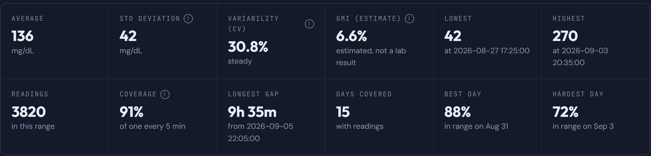
Twelve numbers for whatever stretch you're looking at. Anything estimated rather than measured says so on the tile.
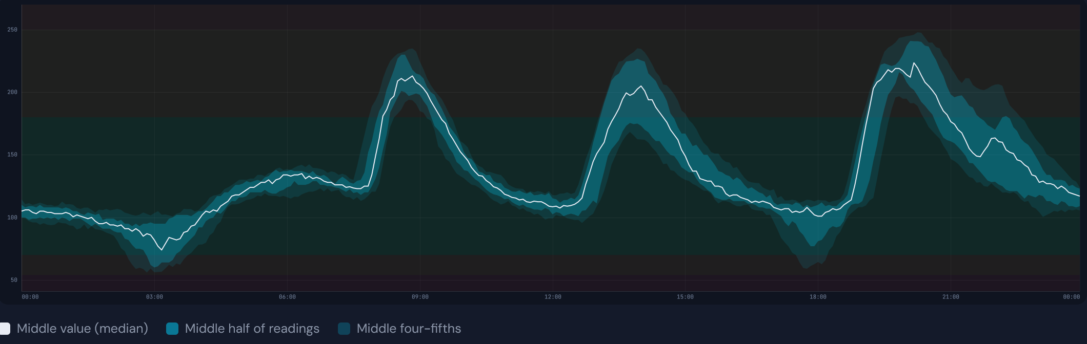
A typical day
Every day you loaded stacked on top of every other one. The line is the middle value at that time of day and the shading is how spread out the rest were, so a bump that happens most mornings shows up as a bump here.
Time in range
How much of the time sat in each zone, as one bar for everything together and then one bar per day underneath. Move a threshold and every percentage moves with it.
A stacked bar of one day split into five zones, with the percentage for each, and two boxes for the low and high thresholds.
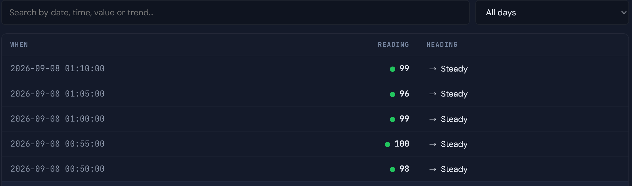
Every reading
The whole log as a table, newest first, with a search box and a day filter. Useful when you know roughly when something happened and want the actual numbers.
One more card turns up when the files hold it. Newer releases write down how the display itself was doing at each reading: the service, the battery, the signal, how long it had been running.
06 Taking it with you
Turn the card into something you can hand to somebody
One button marked Export opens a list. Choose how much to include, the stretch you're looking at or everything, then pick a shape.
- A printable report. The one to take to an appointment, charts included. Every printer dialog offers "save as PDF" if you'd rather email it.
- The same report as a single file. One self-contained web page, openable years later with no internet connection.
- A spreadsheet. Three sheets: every reading, a row per day, and the summary figures.
- An editable document. The report as a word-processor file, for when you want to add your own notes first.
- Plain readings. One line per reading, in both units, in the format any spreadsheet will open.
- A daily summary. One line per day with the count, the average, the lowest, the highest and the five zone percentages.
- Everything as raw data. The readings and every figure the page worked out, in one structured file.
- Pictures of the charts. The timeline and the typical-day chart each have a save button.
Where these files come from Every one of them is built inside the page, on your own machine. Nothing is sent anywhere to be made.
07 Your numbers
The colours should mean what your clinic means
There's a switch at the top for mg/dL or mmol/L and the entire page follows it, charts and exports included. The zones are yours to set too: put your clinic's numbers in and every chart, percentage and report follows them, remembered for next time.
Four threshold boxes, with a colour legend underneath showing what each band covers.
Every demonstration on this page shares one set of thresholds and one invented day. Change a number anywhere and the rest follow.
08 Getting started
Open it and have a look
No card yet? Open the viewer and press Try it with sample data.
CYGM is an open-source, experimental secondary CGM display. It is not FDA-cleared or FDA-approved, and it has not been clinically validated. It shows readings that have already travelled through your own CGM's app and cloud service, so it can lag, gap or fail independently of them.
Never use it as the sole basis for a treatment decision, and never rely on it as your only alarm. Always confirm on your prescribed CGM receiver or app before dosing or treating.